UX CASE STUDY
UCI Cinemas App
Heuristic Evaluation & Redesign
Have you ever tried to reserve a movie ticket using the UCI Cinemas app only to be lost in a maze of screens and buttons? This case study explores the app's primary usability flaws through Heuristic Evaluation and Usability Testing.
To understand why certain actions appear to take forever and to simplify the critical capability of booking a ticket for efficiency.
The primary difficulty lies in the large number of taps (approx. 13) required to complete a booking, compared to nearly half that amount on the website.
This article is based on my personal experience as a user of the UCI Cinemas app, where I encountered several difficulties in making a basic movie ticket reservation.
After rating user stories and flows, I opted to focus on the following process:
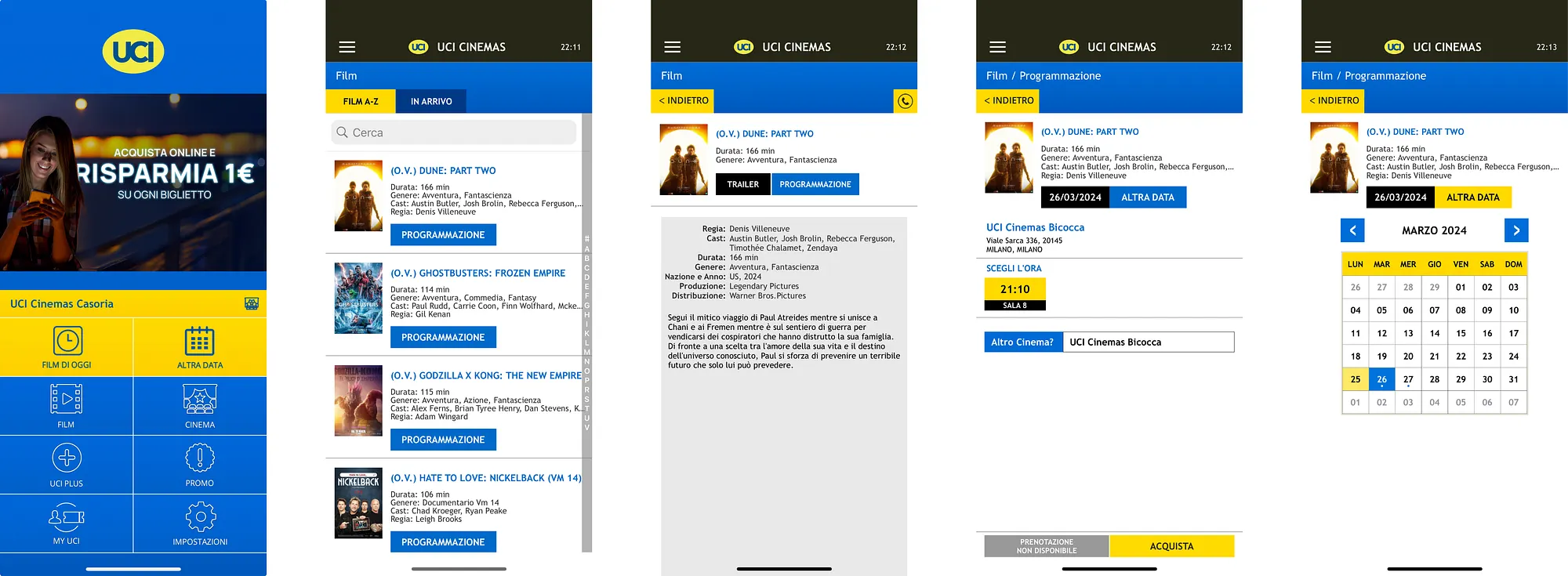
Booking a ticket for a certain movie on a specified date and time.
Interestingly, understanding how to do this activity was not very challenging. The primary difficulty was the large number of taps required to complete the booking procedure.
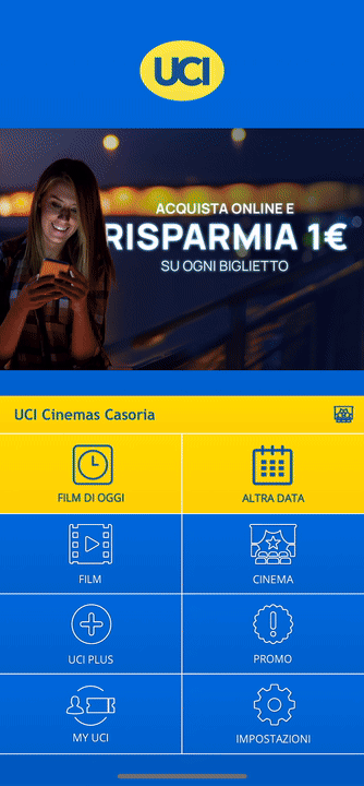
Surprisingly, this critical capability required around 13 taps on the app. In comparison, the website requires approximately 7 taps. Why should customers use the app when the website provides a substantially more efficient booking experience?
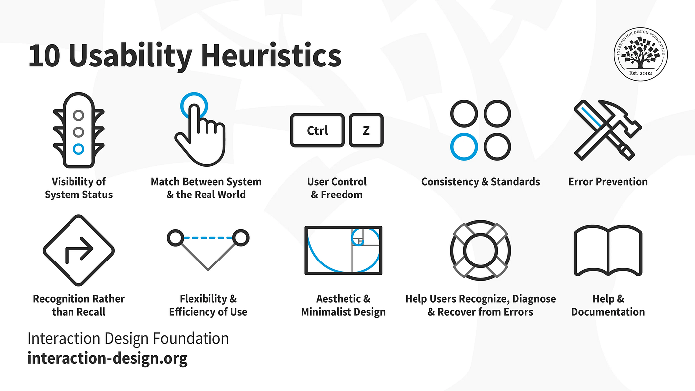
I extensively investigated Nielsen’s 10 heuristics to gain deeper insights into UX issues. These heuristics provide criteria for assessing the usability of user interfaces.
A usability problem’s severity is assessed using three main criteria: Frequency, Impact, and Persistence. The rating scale ranges from 0 (No problem) to 4 (Usability catastrophe).
I concentrated on a few heuristics closely related to the movie booking procedure.
Interfaces should not contain information that is irrelevant or rarely needed. The UCI app interface comprises 5 screens for various features, with 3 full displays dedicated exclusively to movie searches.
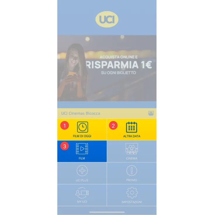
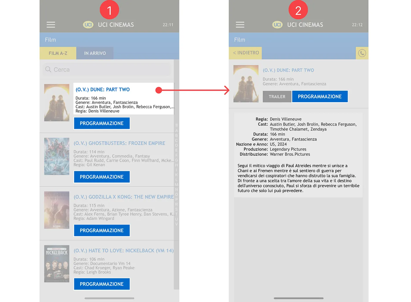
The developer runs the risk of giving consumers too many alternatives at once, leading to potential cognitive overload. Furthermore, there are redundant elements like the "Programmazione" button appearing on both the list and the specific movie page.
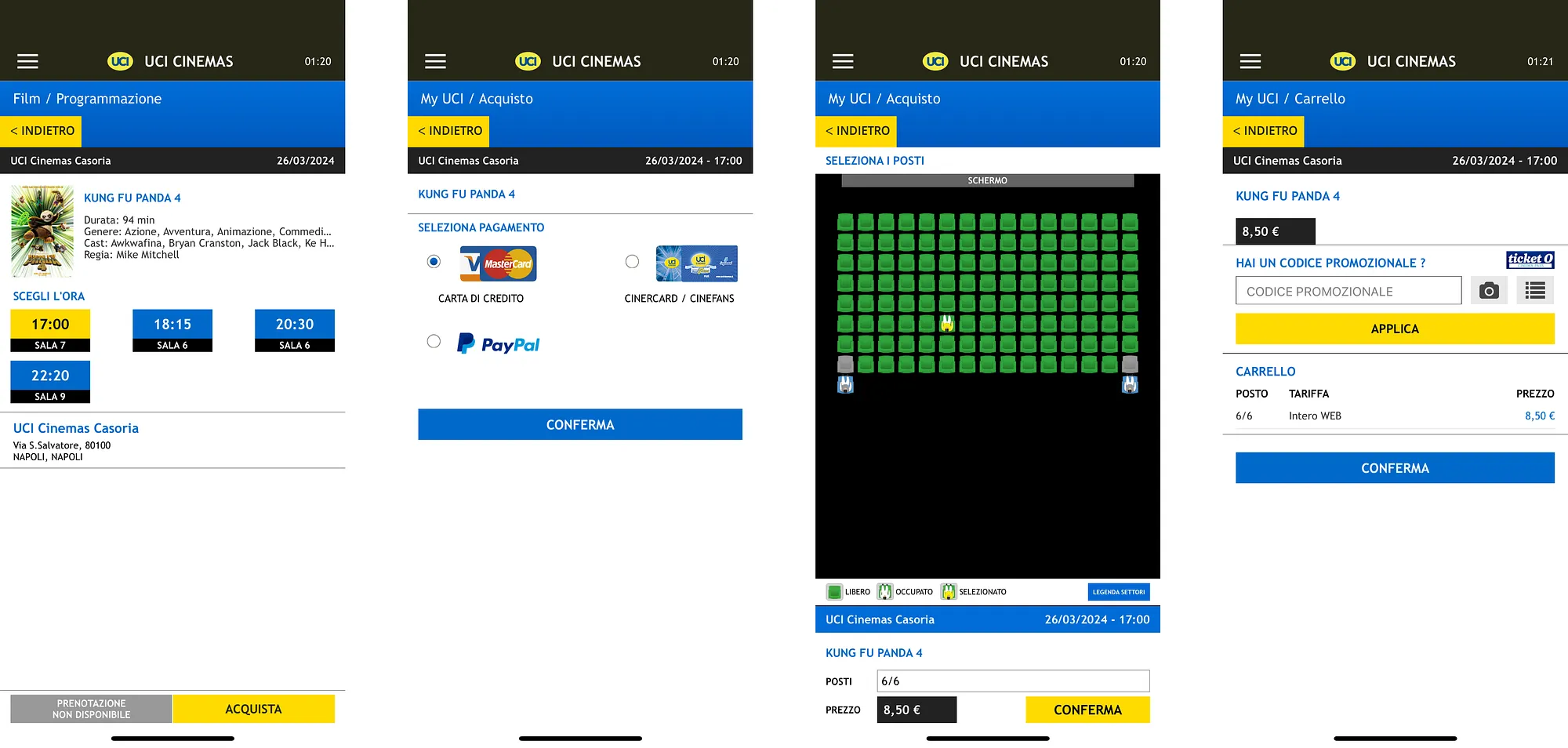
Users are asked to select a payment method before picking seats. If they want to change it later, they must go back through several pages, re-select seats, and re-confirm.
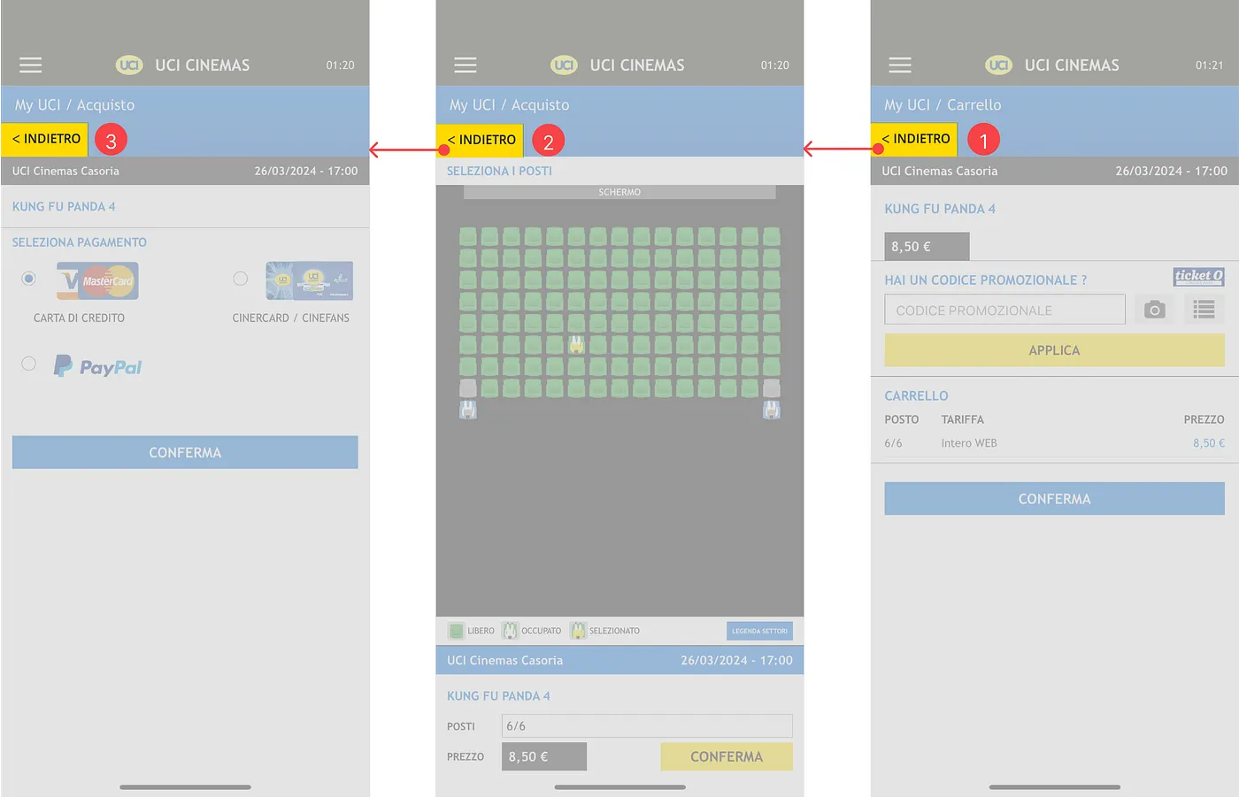
The rigidity of the ticket purchase process makes it inefficient. The "emergency exit" to change payment isn't simple; it's a forced retracing of steps.
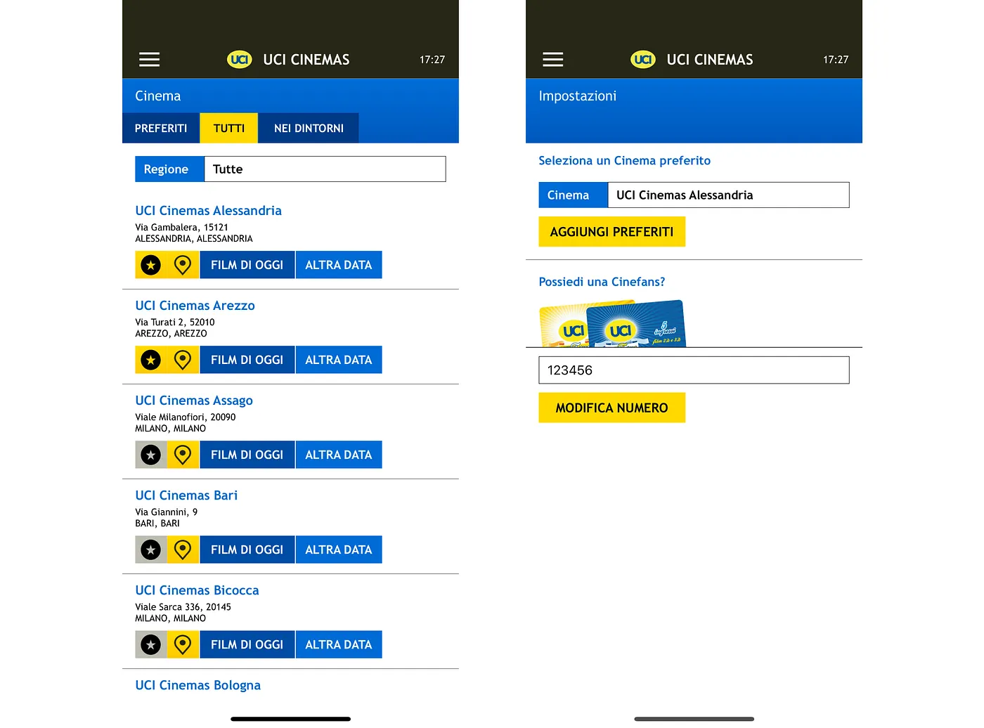
The app displays a selected cinema based on favorites or location, but doesn't clearly state the criteria or the change in status. If a user has multiple favorites, the app might auto-select the closest one without clear indication.
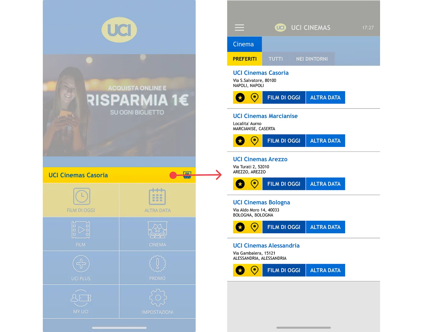
This lack of clear system state can cause confusion, as users may incorrectly believe the favorites list always reflects their current decision.
I conducted a monitored usability test with 6 participants, asking them to purchase a ticket for a specific movie on a specific date and time. Participants used the "Thinking Aloud" protocol.
By streamlining the flow and removing redundant steps, we achieved a significant reduction in friction for the primary task.
46% Reduction in physical interaction steps.
The combination of heuristic review and usability testing gave a thorough insight into the app’s strengths and flaws.
Analyze competitors to find best practices and new solutions.
Create wireframes proposing solutions to the highlighted difficulties.
Use wireframes as prototypes for further user testing and modification.
Using these data, we plan to take proactive actions to improve the entire user experience of the UCI Cinemas app, resulting in a more intuitive and user-friendly platform for Film lovers.