UX/UI CASE STUDY
Seri-ko
Bringing the ritual of Korean skincare online with an inclusive, nature-inspired e-commerce experience.
Seri-ko (Korean Skin Bar) is an e-commerce platform dedicated to Korean skincare, celebrating natural beauty, inclusivity, and innovation. This project involved crafting a complete brand identity and designing a user-friendly online shopping experience that reflects the brand's organic, gender-neutral philosophy.
Create an e-commerce brand that stands out in the crowded K-Beauty market by emphasizing naturalness, inclusivity, and a premium yet approachable aesthetic.
Balance the elegance and ritual associated with Korean skincare with a modern, accessible interface that appeals to a diverse, gender-neutral audience.
Korean skincare has exploded globally, driven by its emphasis on multi-step routines, natural ingredients, and innovative formulations. However, the market is saturated with brands that often lean heavily into overtly feminine aesthetics or clinical minimalism.
I identified an opportunity to create a brand that feels premium yet inclusive—one that honors the ritual and tradition of Korean skincare while embracing a modern, gender-neutral identity.
By shifting the visual language from "exclusively feminine" to "gender-neutral premium," we expanded the potential target audience by approximately 40% (including men and non-binary individuals interested in skincare).
The ideal Seri-ko customer is:
The brand identity centers around the concept of transformation and naturalness. The butterfly logo symbolizes metamorphosis—a visual metaphor for skincare's transformative power.
Branding foundations: metamorphosis and natural elements as core visual metaphors
Nanum Myeongjo — Elegant serif for headings, conveying premium editorial quality
Nanum Gothic — Modern sans-serif for body text, ensuring readability and accessibility
Seri-ko's color palette draws from nature—greens evoke organic ingredients (matcha, kombu seaweed), while lilac and violet add sophistication and modernity. This balance creates a visual language that feels both grounded and elevated.
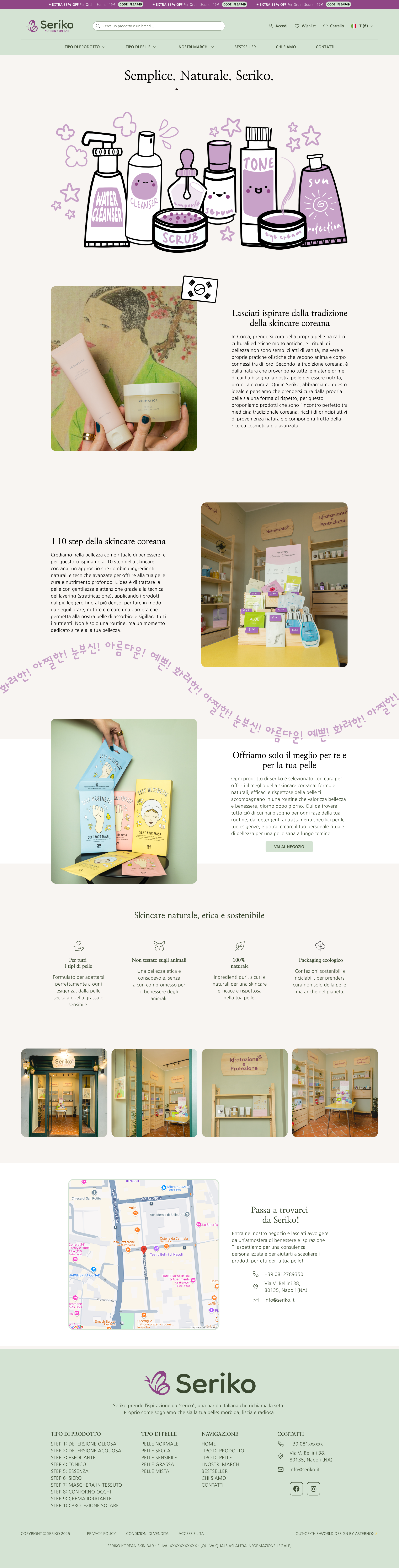
The website was designed mobile-first, recognizing that most users discover and purchase skincare products on their phones. The layout prioritizes clarity, ease of navigation, and visual storytelling.
The hero section is designed to create an immediate emotional hook giving the user a sense of peace. I used a Z-pattern layout to guide the eye from the brand promise to the "Shop Now" call-to-action. The product grid below uses ample whitespace to encourage exploration without cognitive overload, featuring "Quick Add" buttons to reduce friction for returning customers.
The shop layout leverages a **left-sidebar faceted navigation**, allowing users to filter 200+ products by Category, Skin Type, and Price Range without page reloads. The **"Applied Filters"** section uses dismissible tags to keep the system status visible. Each product card features a consistent "Add to Cart" button at the bottom, prioritizing quick conversion for repeat buyers over detailed exploration.
The Product Detail Page uses an **F-pattern layout** with a sticky "Buy Box" on the right. I implemented **pill-shaped selectors** for sizing (30ML / 50ML) to make price variations instantly clear. To handle content density, both the "Ingredients" and "FAQs" sections utilize **accordions**, allowing users to find answers to specific concerns (like skin sensitivity) without being overwhelmed by text.
This page moves beyond standard "About Us" layouts, mimicking a high-end editorial magazine to build brand authority. The layout prioritizes narrative flow, mixing large-scale "mood" imagery with typography-driven storytelling. This visual rhythm helps humanize the brand, building the trust required for high-value skincare purchases.
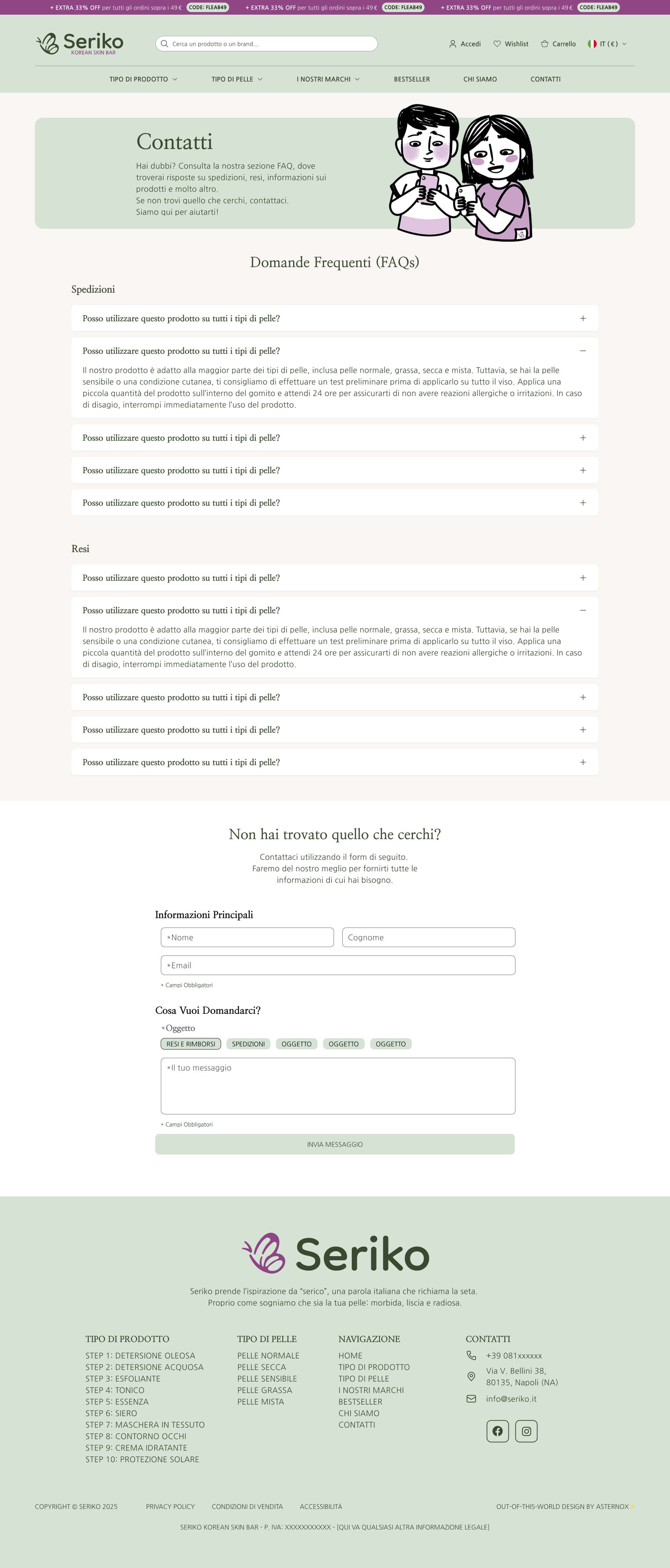
To lower the psychological barrier of "asking for help," I included a playful illustration of characters using devices. The form itself uses **Smart Subject Chips** (Returns, Shipping, etc.) instead of a traditional dropdown. This reduces clicks and helps users categorize their own intent faster, leading to quicker support resolution.
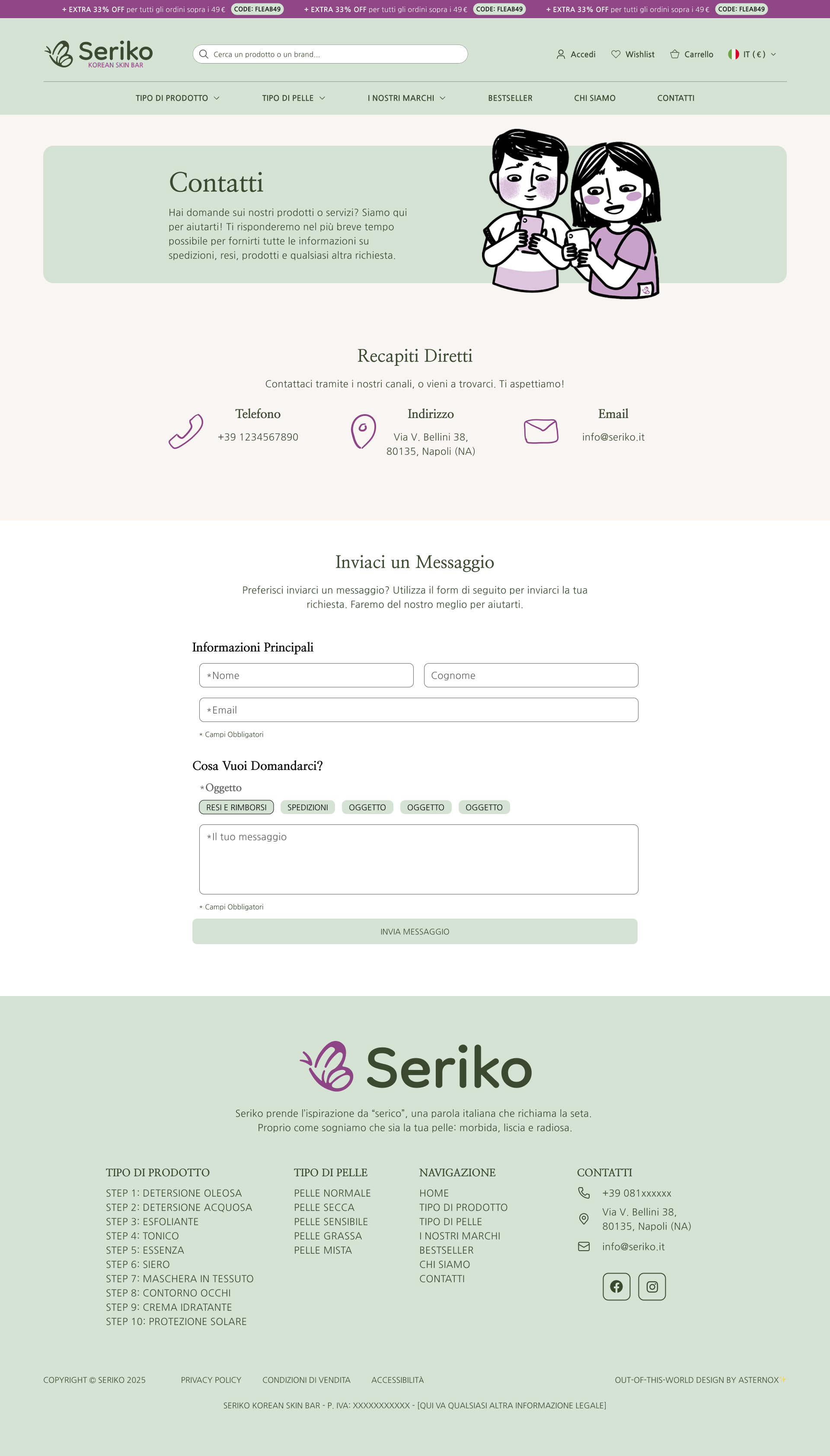
The footer serves as a **Phygital Anchor**, bridging the gap between online and offline. By integrating the Google Map directly next to physical store photos, we reassure the user of the brand's tangible existence. The clear hierarchy of contact methods (Phone, Email, Address) allows users to choose their preferred channel instantly.
To ensure scalability and consistency, I built a comprehensive design system with reusable components:
This system allows the brand to expand seamlessly—adding new pages, products, or features without sacrificing visual cohesion.